Logitech · Experience Design
Logi Circle 2.0
Home security made simple
Designing Circle 2.0
Home security is a competitive space. My role was to help shape the vision for Circle 2.0 and work hands-on as a designer.
I led the UX across the entire product ecosystem, partnering closely with the visual, engineering, and industrial design teams. The scope covered everything from the core app and subscription flow to out-of-box setup and product roadmap
The app experience
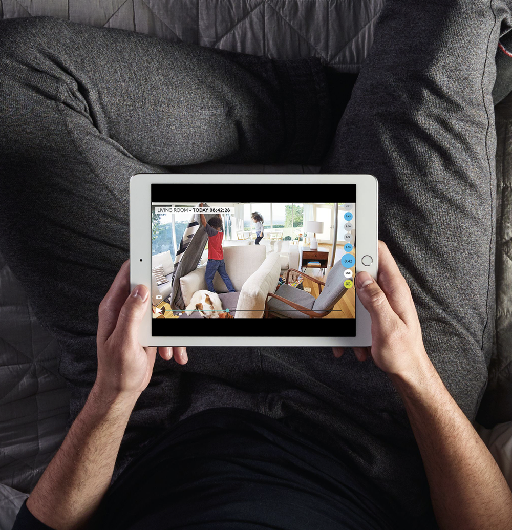
A window into home
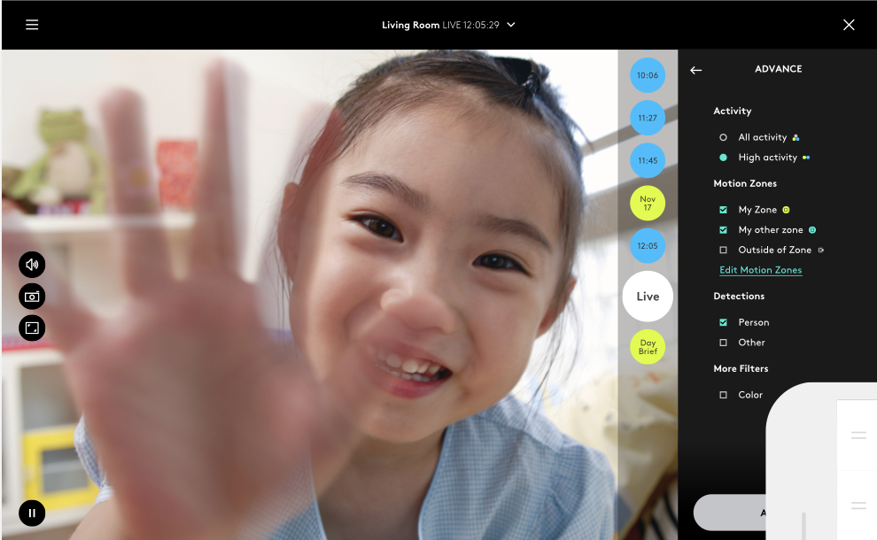
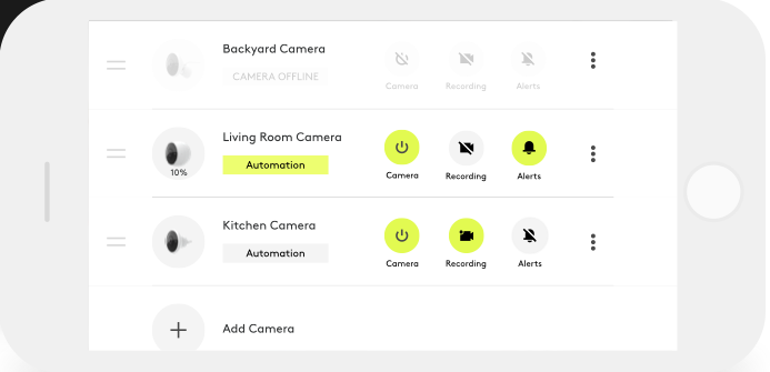
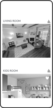
The app experience was a major market differentiator. We designed a fluid, bubble-based scrolling interface that felt incredibly natural on both mobile and iPad. This signature visual and interaction language wasn't just for the main view—we scaled it across the entire product, ensuring a seamless flow from initial setup through advanced settings and subscription purchasing.
Understanding the users
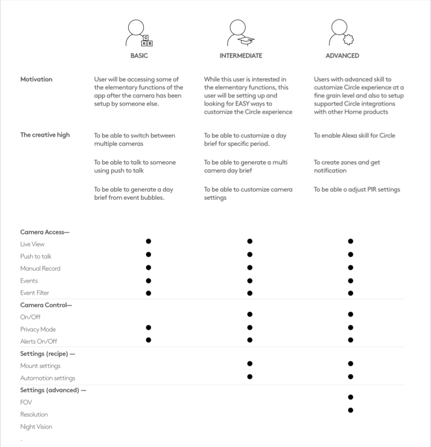
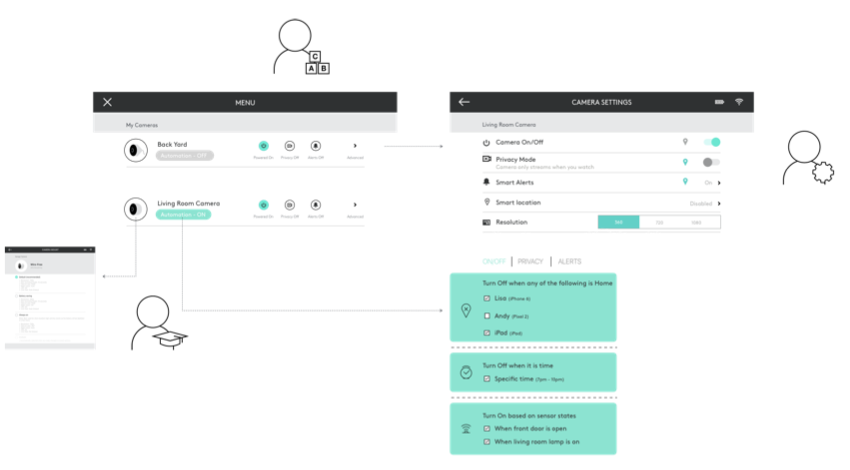
A Layered Experience Model
To accommodate varying levels of technical comfort, the menu system was driven by basic, intermediate, and advanced user archetypes. I collaborated with cross-functional teams to design a shared experience model, that made everyday camera access effortless, while progressively revealing advanced customizations for power users.
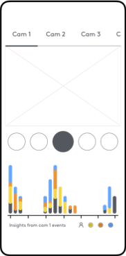
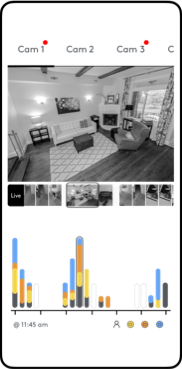
Portrait-mode exploration
Important moments, within reach
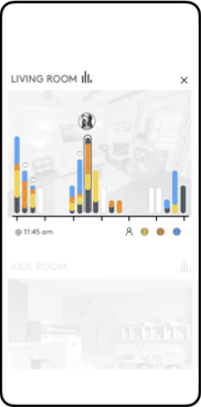
Designed for quick, on-the-go monitoring, these wireframes optimized the interface for one-handed use. I explored interaction models for easily swapping between camera views, reviewing triggered events, and manipulating the activity graph timeline to uncover patterns.

Circle Safe - Subscription Redesign
Rethinking subscriptions & multi-camera plans
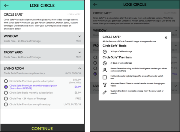
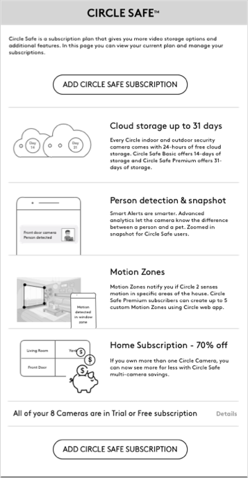
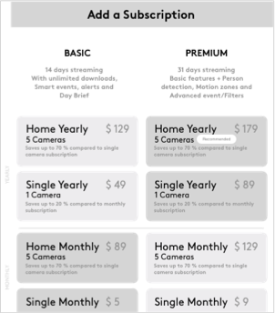
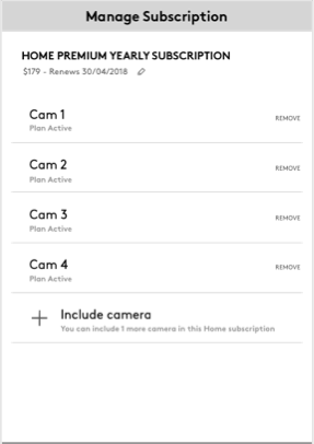
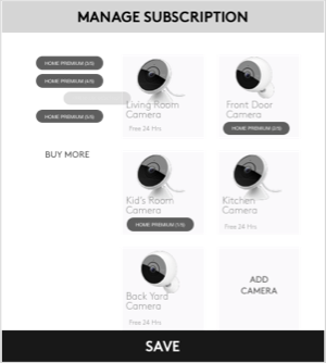
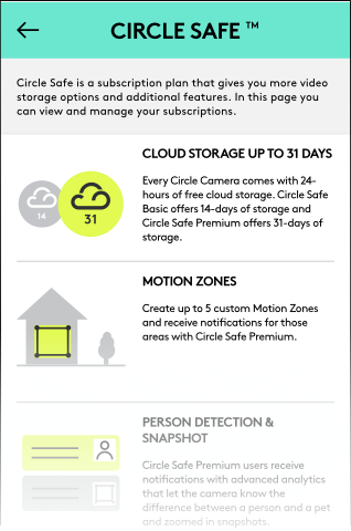
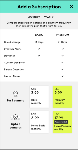
The original Circle 1.0 experience mapped subscriptions strictly to individual cameras, creating friction as users expanded their setups. To solve this, we redesigned the flow to simplify how people compare plans, select coverage, and manage multiple devices. Guided by rapid user testing, we iterated the purchase experience to clearly educate users on tier benefits and seamlessly integrate new multi-camera discounts. The final outcome was a highly successful, user-friendly subscription model.
Legacy version screen with usability challenges
Craft and ownership
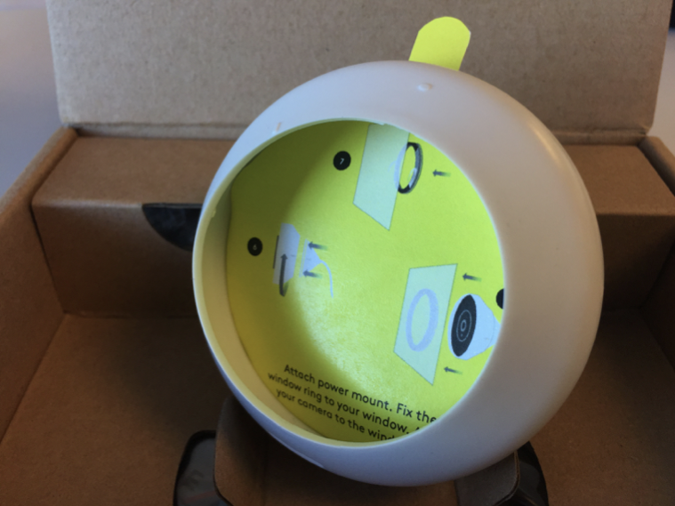
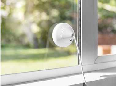
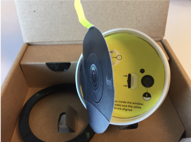
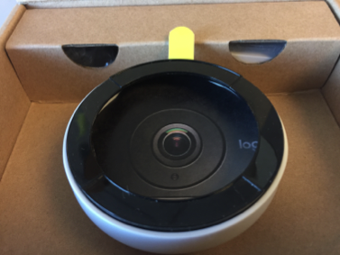
The product experience begins with unboxing
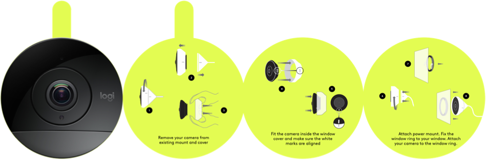
Taking ownership of the complete, end-to-end user journey, I stepped beyond my digital scope to design a physical unboxing experience. Drawing on my early days designing greeting cards, I prototyped a quick-start guide that unfolded directly around the product to explain window mounting. This proactive, tactile solution clarified the physical setup and successfully reduced overall product returns.
More work
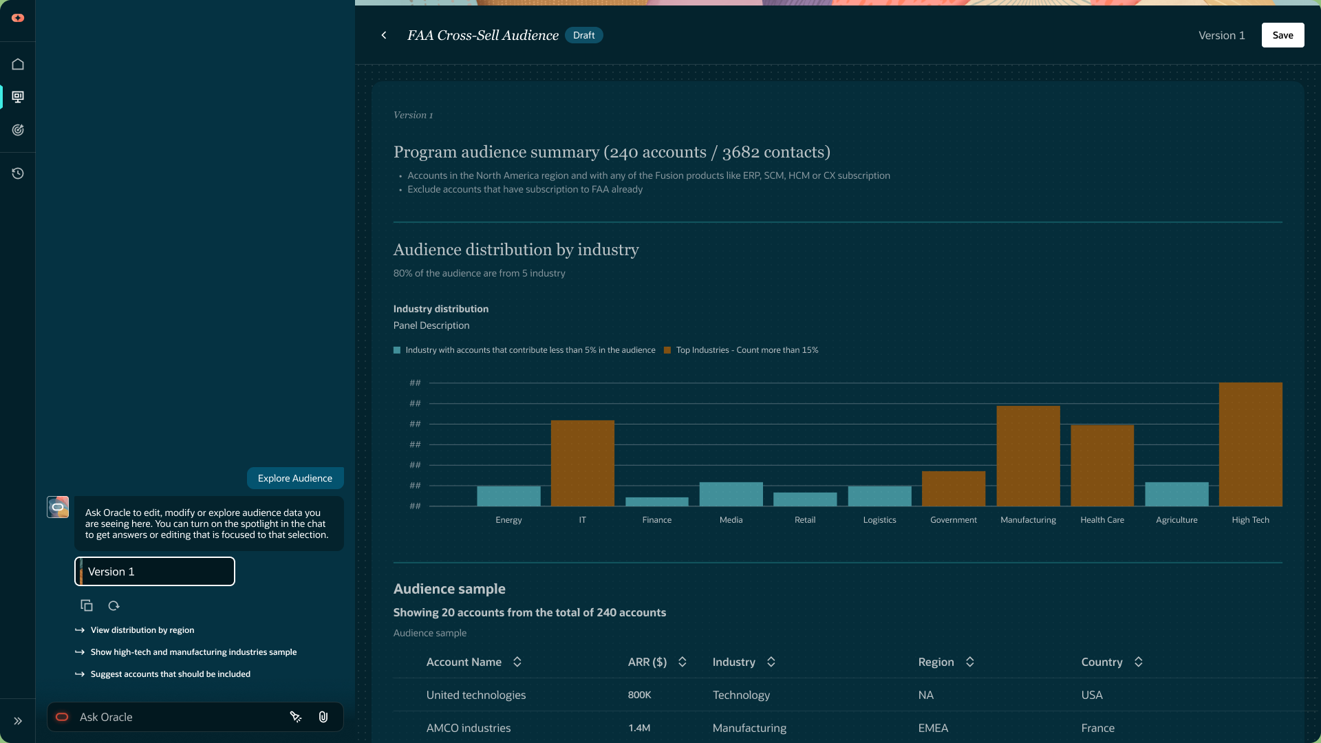
Spotlight
A design jam project to spark ideas supporting Agentic app experiences
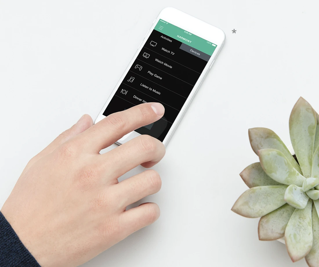
Harmony
Entertainment and smart-home control
Agentic Audiences
Accelerated Redesign: Powered by Vibe Coding
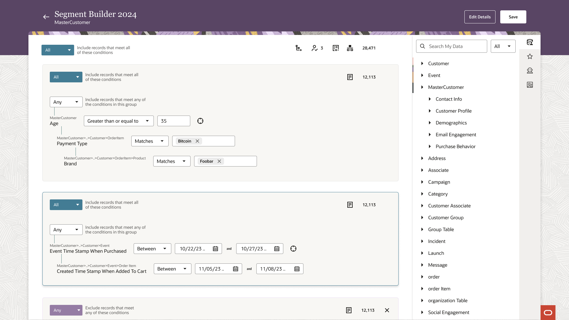
SaaS application to Agentic AI experience
A holistic design journey spanning discovery research, scalable design systems, and advanced AI user experiences.